
branding
webdesign
omit studio is a creative practice built on the conviction that the most powerful work is found through distillation. The identity is a self-initiated study in how a brand can exist with maximum impact and minimum noise. By removing everything non-essential, the studio’s visual language becomes a neutral vessel for the work it houses.
colour palette

The studio utilises a grayscale palette to symbolise adjustability and a seamless conformity to the unique visual worlds of its clients. By leaning into the principle of "less is more", these neutral tones provide a versatile foundation that avoids being confined to a single, static style.
typography
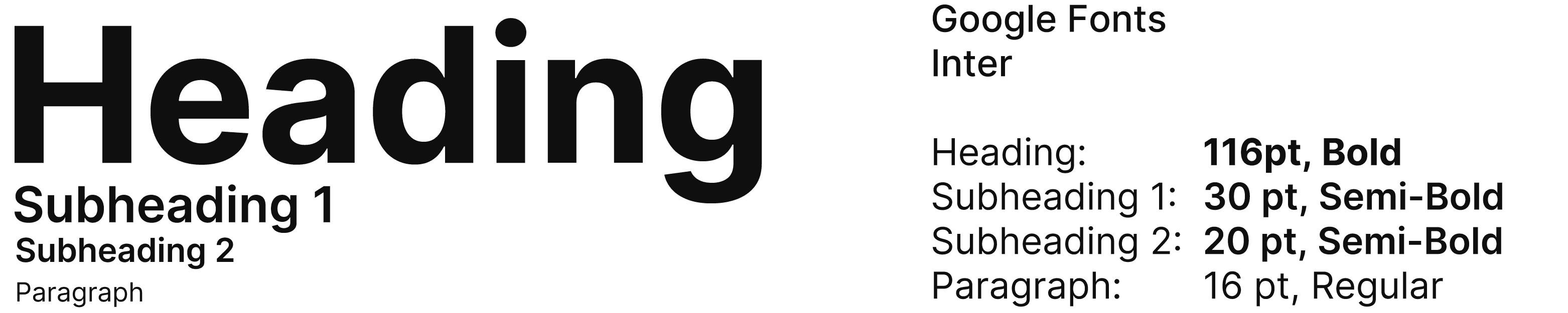
Inter is a highly accessible typeface that demonstrates the functional strength found in simple, direct communication. By intentionally contrasting varied sizes and weights, the typography establishes a clear structural hierarchy that remains legible while emphasising the impact of a minimalist layout.