branding
webdesign
The Balconier is an Amsterdam-based service specialising in transforming small urban spaces - balconies, façades, and small gardens - into sustainable green retreats. The challenge was to create a digital presence that feels as organic and approachable as a garden, yet as precise and reliable as an architectural plan. The resulting identity balances a soft, natural palette with a clear, functional layout that simplifies the process of making a greener city step by step.
colour palette
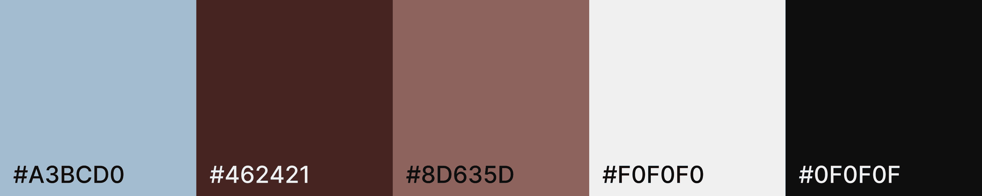
The color selection originated from the client's specific aesthetic requirements, focusing on a primary contrast between a soft, light tone and a deep, grounded base. To ensure the identity felt unified and professional, the palette was extended with neutral anchors and a mediating mid-tone that provides better visual flow. This expansion allows the brand to maintain its personal character while gaining the structural coherence needed for a functional business identity.
typography
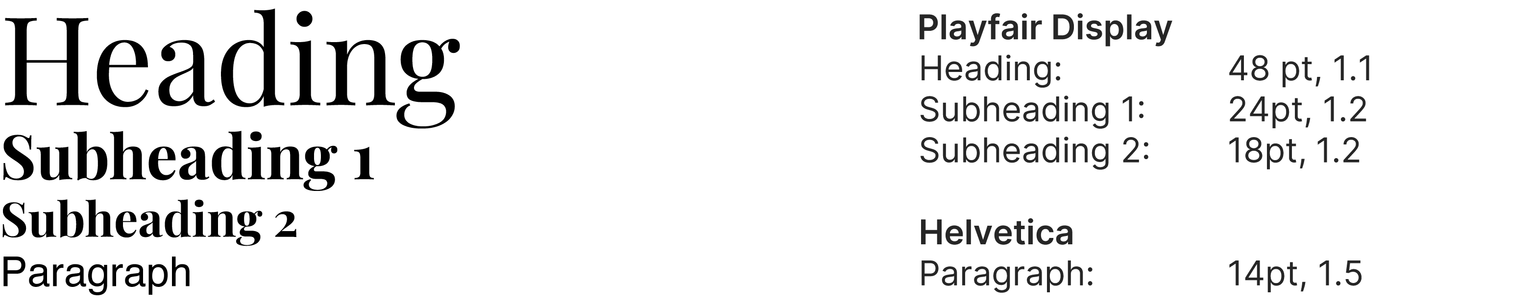
The typographic system is a strategic pairing of serif and sans-serif fonts. Playfair Display is used for headings, offering a high-contrast, classic style that complements the Didot-inspired logo. For body text, Helvetica was selected to ensure maximum legibility. This combination was also a practical solution to a limited font selection on the client's web design platform, demonstrating how technical constraints can lead to a functional and harmonious design pairing.
visuals